UNIT 7 TASKS
Unit 7 Task1
RESEARCH ON MEDIA PLATFORMS
Facebook is a company and online social networking service created in Menlo Park, California and inaugurated on February 4, 2004 by Mark Zuckerberg along with associated Harvard College students and roommates.
Media Impact: In April 2011, Facebook created a separate platform to promote markets and creative agencies, helping them advertise their brand. It all started with the idea of inviting a selected group of British advertising leaders for meeting Facebook’s top officials in February 2010.Currently, Facebook has pushed the popularity of some companies such as ‘’True Blood’’, ‘’American Idol’’ and ‘’Top Gear’’. In 2012, Miss Sri Lanka Online beauty parade, gained views due to Facebook’s exclusive way of advertising.
Media Impact: In April 2011, Facebook created a separate platform to promote markets and creative agencies, helping them advertise their brand. It all started with the idea of inviting a selected group of British advertising leaders for meeting Facebook’s top officials in February 2010.Currently, Facebook has pushed the popularity of some companies such as ‘’True Blood’’, ‘’American Idol’’ and ‘’Top Gear’’. In 2012, Miss Sri Lanka Online beauty parade, gained views due to Facebook’s exclusive way of advertising.
Social Impact: Facebook has been successful and more socially impactful than many other social media. For example it has changed how people communicate; it is easier to send a message to someone using Facebook than e-mail as on Facebook you can receive the reply that you’re waiting for faster than on e-mail.
YouTube is a media platform which was made for sharing videos. There are many people around the world using You Tube and creating accounts on this site that allows anyone to watch and upload any kind of video that they prefer. Thirty five hours are uploaded to this media platform every minute of the day.
Due to the tight control over their media, the content of film and television companies are often uploaded on YouTube by fans, so people could watch high quality trailers and shows that have been aired recently on repeat.
Some specific features that this media platform presents include writing subtitles so people from other countries can also understand, comment on videos and find people with the same interest as you and finally it allows you to restrict the views of the content that you have uploaded. The reason why this is a good feature is that it gives you the opportunity to hide the videos that you don’t want to be public and you have control on what goes up on your website.
Instagram is an online mobile, photo and video sharing platform created by Kevin Systrom and Mike Krieger , that came out in 2010. It is also a social networking service that allows you to take pictures and videos, share them publicly or privately on the application as well as other media platforms such as Facebook, Twitter, Tumblr and Flickr.
The feature that allows you to speak with your friends by sending each other messages and only photos, was added in December 2013. You can send a picture to a specific user or group of users. This was also viewed as a response to the popularity of services such as Snapchat.
The Instagram Stories were launched on August 2, 2016. These are similar to the Snapchat stories and it gives you the chance to share your media, photos and videos, on your account and after 24 hours they will disappear and won’t be showed after on your profile grid or in your friends feed.
YouSendIt- I have chosen this one as a solution because it fits the most into people comfort sizes.You just upload a file , select an email address that you want to send it to ,and then YouSendIt does the rest.
Then, when your file is ready, this site will send an email to your receiver notifying them that you have sent a file and also a link is given to go and download the respective folder.
This also allows you to track when your files are downloaded .This is the most attachment as it still works in your e-mail inbox. Anyone can click a link in their e-mail, but there are more steps that are involved with the other ones.
Moreover, the files can be up to 100MB in size for the free account that means you can even send movies to your friends.
Dropbox- I have chosen drop box as my second solution because it seems to be a great way that helps you to share pictures or videos without any problem.
Firstly, all you do is to throw your files into a dropbox file that you want to share, then click on the folder and select ‘’generate link’’. This will give you a link that will allow you to share that single folder with anyone and from there all you need to do is to paste that link into an email and hit ‘’Send’’ and the person that is on the other end of your e-mail just has to click the link and the folder with its content will start to download automatically.
Moreover, this is really beneficial because it won’t require you to install anything more than what you already use, but the only bad part about it is that the large folders will occupy your available space on Dropbox.
WeTransfer
Another option would be to send your files over a website, called WeTransfer, a simple, user-friendly that has some pretty features.
Sending files on this site is really simple, as all you need to do is to type your email address and the friend’s email address and then attach the folder and click ‘’Send’’. After that, the file gets uploaded from your computer to WeTransfer, which will email to you and your friend to notify when the upload is finished; finally, they will email you when your friend has downloaded the file.
The benefits of this are that you can do this on your computer and that you don’t need to sign up for an account. You can send up to 2 gigabytes of data! Also, the average email client will only allow you to send 20 megabytes, which means that this site can move roughly 100 times more data than the regular email.
Task 2
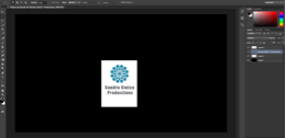
Logo design
In these two screenshots I was editing my new logo. I tried to get rid of the dark background and the white as well and just keep the shape and the title. But it still needed something that would come out. The colour of the shape was fine but the colour of the title wasn’t that attractive so I tried to change it to dark, so now it stands out more. Also, I tried to place the title somewhere else so it would look different a little bit, but professional at the same time.
I’ve chosen this colour because I like it and because it’s simple but eye catching.
That’s how my logo was looking like when I was finished. I think it much better than my first one as it looks more attracting, simple and more as a first logo of a media Level 3 student.
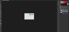
BUSINESS CARD
I have chosen to make the text darker because it wasn't very clear when I saw it in the print size or very eye-catching. The colours of the lines are related to my website and i liked them because they are really bright and simple. I used the white background because it stands out and additionally it gives a professional air to my business card.
The colour of the flower is blue as well as I thought blue and white would look good put together.
I decided to also move the QR code because it wasn't looking nice on the left side and moreover when I would print it off it might not come up ; it was too much on the edge of the card.
Then I decided that I don't really like the lines and even Sonia said that it doesn't look very professional . I had also too much unimportant information such as my college , so i deleted it and put my address and website address. I changed the background colour too and now it look better then the previous one. I love the contrast of the pink and blue shadows in the corners and also the new font of the title makes it look more attractive , compared to the other one.I still have the Qr code on the front but i would like to delete it and put it on the back of my card , but this is my finished BUSINESS CARD. I went on vistaprint and tried to put my business card in there but i didn't printed out yet.
MY WIRE FRAMES:
This would be my ‘’Home’’ page. I would have displayed lots of various pictures related to my ideas and at the bottom I would have a title with my name and maybe the logo. By clicking that title I would go straight to my website.
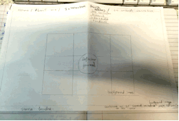
This is how I thought my ‘’reflective journal’’ page would look like. I would as a background of it a range of pictures that would be actually included in the reflective journal and somewhere in the centre to have the title and the document, which will direct you to my reflective journal.
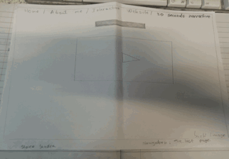
This is my ‘’30 seconds narrative’’ page where I would have presented on the screen my video and a title of its name above it.
This is my ‘‘about me’’ page, where I can have a big title and then a box in which would be some information about me. My logo as well would be included on this page.
Then I could have some other small boxes that would tell you interesting things about such as my hobbies.
MY YOUTUBE CHANNEL
TASK 3 - MY WEBSITE DESIGN
I’ve chosen this example because I really like that clarity of the picture, but I think I am going to change with a picture of me, as it is my own type of page, but i deleted this ''home page'' as it wasn't my work and made my own ''home page'' where i have put my logo and my menu with the pages and a picture of the clouds taken and edited by me. The icon with the palm as i think it looks interesting and looks like a signature of mine on the home page.
Then I’ve decided to keep the ‘‘about me’’ page but change its design to how I like it, with my own information.I also edited the way in which my information will come up and the font and seize of the titles. Moreover , i have put another picture of me , edited, where i looking somewhere , so I've added the text to the direction where i was looking. Now it seems like i am looking at the ''About me ''text. I added a motivational quote too as I really liked it and i think it describes me.
Furthermore, I have changed the ''contact me'' page and did my own one , which looks ten times better and attractive than the other one. I love it! The picture that I have put is taken by me in Greece , three years ago and all i needed to do is just a little bit of edit and now it looks brilliant. I think that this page is my favourite ! The white background and the text just give a nice and professional effect to the page.
Also, I’ve changed the background photo of my ''30 seconds narrative'' page because they all had the same picture and added a collage of the pictures that we have taken when we filmed my video in the post office. I have chosen it as my main page picture because it presents the behind the scenes shots that we took and also because it displays my idea very easily to the people who are looking on my website for the first time.I didn't like it at the beginning but now I think it looks really nice and original . I think the text and its font are the ones who make the picture and the page seem more attractive . I believe that now my page looks like a media student page and i am very proud of it.
Moreover, I’ve decided to delete the page called ‘’ Book Online’’ and keep the other pages, but re-design them in my own way.
I've added my text for the ''Reflective Journal'' page and changed the appearance of the title . After I discovered some icons and lines I chose two curved lines that will go upside and below my title because it makes it look like the content of it will be a story and I really liked that. It is very attractive and simple too , but it still gives an effect!
For my ''Ideas generation'' page i added a close up shot with some monkeys pens taken in the post office because it looks funny and it gives you a happy feeling . I also wanted that the picture to have link to the information which i will put . I imagined that this will be a fun page because of my ideas and picture!
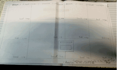
This is how my ''Unit 7 Interactive '' page looks like and I really like this one because it has lots of information and pictures . It shows my developed work! I wrote in white because if I wouldn't change the colour it wouldn't have been possible to read the text . It had the same colour as the background and the white stands out more. I have labelled the tasks so you would know on which task are you and what it contains (made the sub-headings bigger). For the other pages I decided to just delete the media that was there and leave a blank colour until I will add my own media!